MAKING A COLLEGE MAGAZINE Contents PAGE
For my contents page I chose to use a medium close up again.
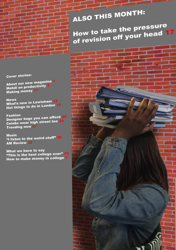
The main picture had the background cut out in Photoshop and replaced with a brick wall pattern. I transformed the perspective of the background to make it more interesting.
I also transformed the perspective of the text and the grey shapes to match the wall to make this look like a more interesting contents page.
For the content that is in the magazine I created a survey and handed it out to people. I created a few graphs in Excel to show what results I got and how it affected my choices. For example, looking at the 4th graph which is what people would like in their magazine I saw that music was the most wanted thing. So I included music into the magazine which was something I did not originally plan to do.

