Double page spread
To create this double page spread I looked in music magazines of many different genres and types to get inspiration. From those I picked out elements I thought would work with my magazine's double page spread.
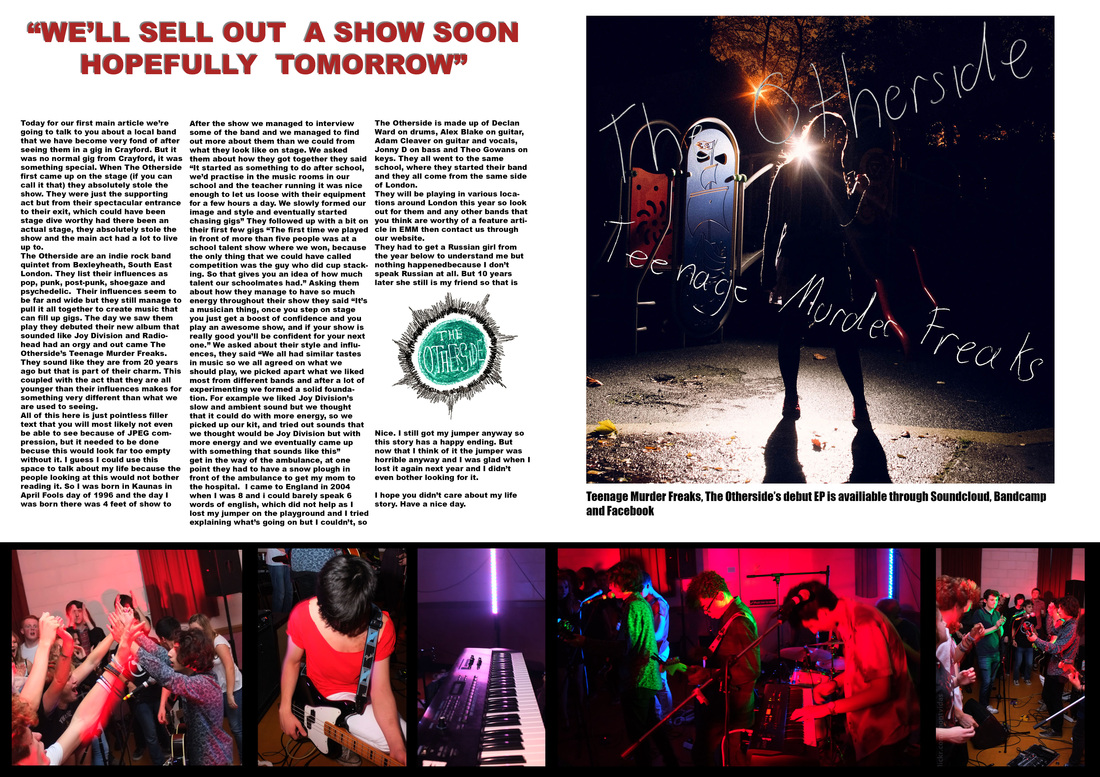
For the top heading I chose to use big, bright red text to catch the attention of anyone flicking through the magazine. In the main text I included the interview with the band, making it relevant to the pictures and coverlines.
The pictures at the bottom are there as a sort of slideshow to show the event to readers, giving them a visual idea to what the article is about and what their gig looked like.
The album art covers a whole page, this could be taken as advertising their album as usually only adverts would have this kind of whole page coverage. I also included the logo of the band to show to the readers what they are.
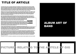
The flat plan here is for both versions as they look almost the same, although I did make changes of the text to have it into three columns to make it easier to read and like less of a wall of text, I did not want this to be a broadsheet but more of a relaxed, entertainment magazine.
For the top heading I chose to use big, bright red text to catch the attention of anyone flicking through the magazine. In the main text I included the interview with the band, making it relevant to the pictures and coverlines.
The pictures at the bottom are there as a sort of slideshow to show the event to readers, giving them a visual idea to what the article is about and what their gig looked like.
The album art covers a whole page, this could be taken as advertising their album as usually only adverts would have this kind of whole page coverage. I also included the logo of the band to show to the readers what they are.
The flat plan here is for both versions as they look almost the same, although I did make changes of the text to have it into three columns to make it easier to read and like less of a wall of text, I did not want this to be a broadsheet but more of a relaxed, entertainment magazine.

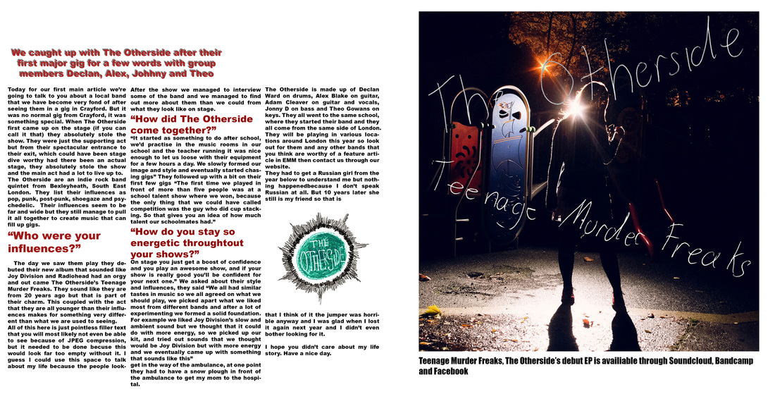
For my second version I made small changes to have more text as magazines would not waste space like I did with nothing, this choice of more text makes it look far more professional.
For the third edit I looked at how music magazines conduct interviews and they all had the questions highlighted for easier reading. This was something I did not do before but it should be done as it makes it easier to navigate and see what the article is. I removed the pictures at the bottom as while I felt that they added to showing people what the gig was like it was not needed as this article is not just about their one show.
I used a white background instead of black because I felt that giving the magazine a too dark look would look too negative, also with black I would have had to have a border around the album cover to separate it from the background as that was also mostly black, I felt that this would be a better looking choice. The green logo of the band does not go with the color schemes I have chosen for this but it's not something I have control over as they made the logo, it it were dark red or black then it would go better with the whole style of my magazine. This double page spread does not go with the color scheme as well as I hoped it would as I used dark colors in the front page and contents page and this is all white.
For the images at the bottom I had to go through around 150 of them that were taken at a gig when they were playing at. I chose these ones to show the atmosphere of the gig and the band themselves. I chose these pictures to show the atmosphere of the gig itself and these pictures show who the band is in the best way. I edited these pictures to have more vibrant colors and higher contrast to make them look more lively and fun.
For the images at the bottom I had to go through around 150 of them that were taken at a gig when they were playing at. I chose these ones to show the atmosphere of the gig and the band themselves. I chose these pictures to show the atmosphere of the gig itself and these pictures show who the band is in the best way. I edited these pictures to have more vibrant colors and higher contrast to make them look more lively and fun.
