Music magazine front cover
For my music magazine's cover page I was looking to get a dark and mysterious look that would interest someone who would see this for the first time in a shop which would make them wonder what this is and attract more attention. I wanted to have a dark, minimalist style for the cover page and I think I used it effectively.
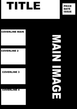
I created this look by using few colors, keeping it dark and without much detail. Leaving it to the viewer to figure out what it's supposed to be. Below is a flatplan of what I wanted this magazine to look like. Only the last version of the magazine's flatplan is included here.
I created this look by using few colors, keeping it dark and without much detail. Leaving it to the viewer to figure out what it's supposed to be. Below is a flatplan of what I wanted this magazine to look like. Only the last version of the magazine's flatplan is included here.
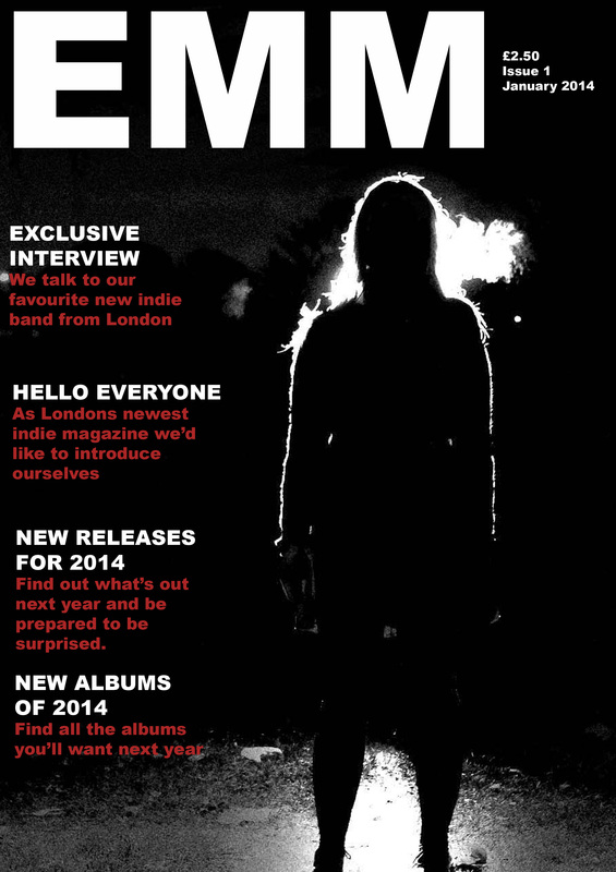
On my second edit I moved the coverlines to the left to follow the left thirds rule and moved the image so that the main subject takes up more space. This was done to make the magazine look more tidy.
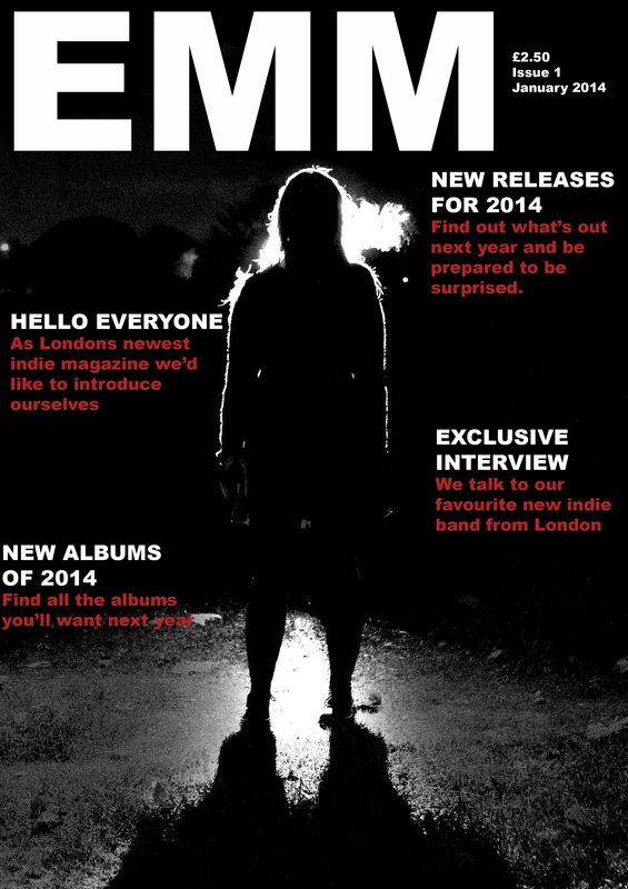
For my front cover I did not want to have any people that could be recognised for a few reasons. One reason for not including peoples faces on the front cover was that as a small, local magazine I would not be able to take pictures of well know people whose face would attract readers, I also wanted to use a new photographic technique I just learnt and this seemed like a fitting place to use this in. I purposefully removed all detail in this picture and kept it mostly black to set a darker mood for this as the image that is relevant to the "Exclusive interview" and the music of the artists. I chose to have my main coverline to be in line and the same size as the others as I felt that there should be equal attention to all of my articles and as I did not have a well known band to feature and the image itself could be the main thing to attract attention. I only used three colors in this cover page as did not want this to look cluttered and messy with many colors jumping out trying to grab the attention of readers and them not knowing where to start looking.
For my third version I used a different picture which showed that this was a music magazine far more clearly. This was done to attract readers that would skim through magazines to find what they want only looking at the pictures and main coverlines. The adding of a sticker of sorts to the bottom left emphasises that it is a new magazine which would make people want to see what it is and whether they should buy it.
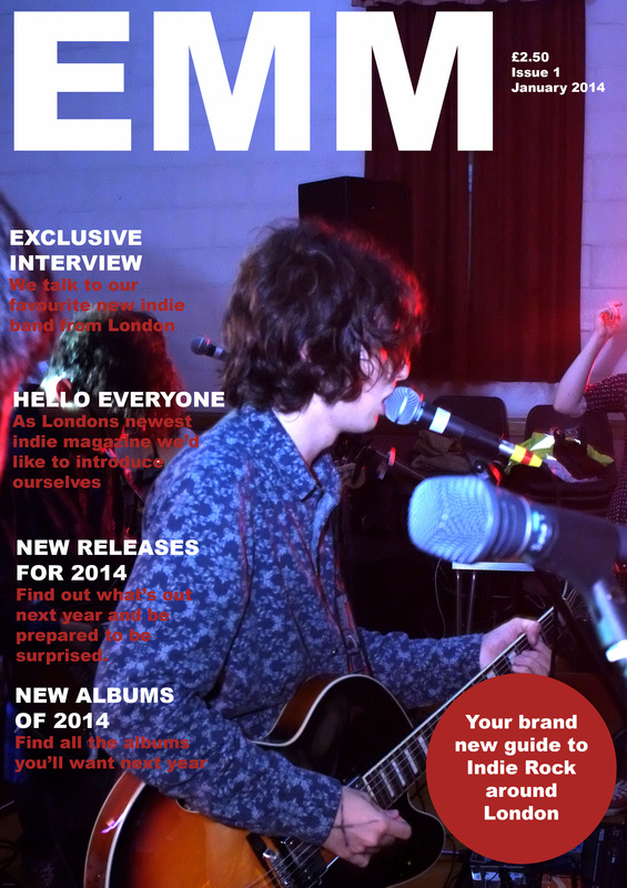
For my fourth version I added a clearly visible main coverline, emphasising it and I also included the name of the band to make it more recognisable to people who may know them.
The last version of this is very different to what I started with and what I originally planned to do, this last version looks like a music magazine now even if you look at it just for a second. The picture I chose to use shows the lead singer of the band playing a song, this makes a more interesting picture than having it staged.
